Tinybop is an educational start-up that makes open-play iOS apps for kids. I had the opportunity to meet the founder of Tinybop, Raul Gutierrez, months before the first product launched. He had the foresight to prioritize the design process to consider the immediate and long-term plans for the company, its ambitious product lines, and future brand extensions. As Tinybop’s Head of Design, I helped launch this brand through its first 11 product titles and steer its visual expressions.
Raul had commissioned a few designers to come up with logo ideas. When he shared the exploration with me, we both thought there was potential in telling a story with one that looked like a mysterious black box with a wind-up key. I refined this direction with the idea that when the key is turned, the colorful blocks drop into the box, and something new is born. What will Tinybop make next?
I came up with a system of patterns that combine an expressive color palette against a warm gray, celebrating inspiration from the 1950s. (More about what inspired the development of this brand can be read here).
Working closely with front-end developer Josh Stewart, we designed a website that is tightly consistent with branded elements, with flexibility to add to the ever-expanding product line.
With a strong presence across social media channels, the identity minimizes itself into icon sets that wink at the main Tinybop identity.
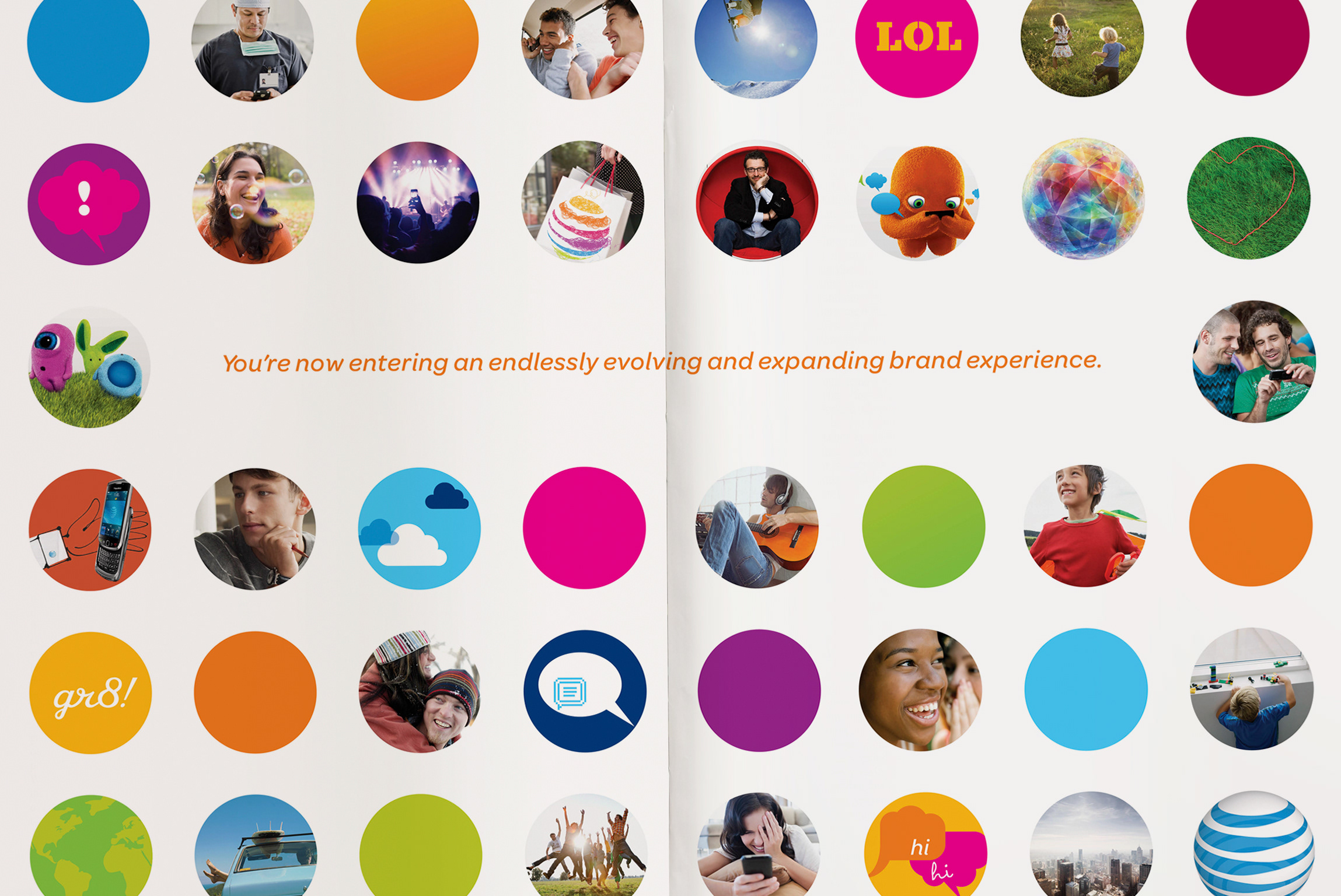
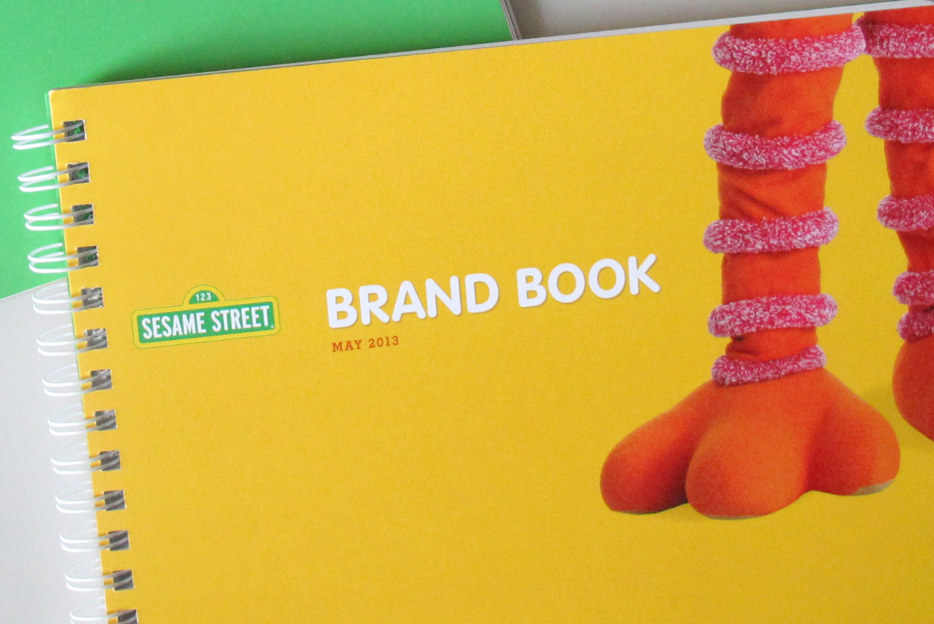
The vision of this brand bases itself on the consistency of branded elements that demand instant recognition, while brimming with constant creative potential to express itself in new and unexpected ways. A brand book shows how.
A few moments for Tinybop's tagline, Toys for Tomorrow.
