Tinybop is an educational start-up that makes open-play iOS apps for kids. I met the founder of Tinybop, Raul Gutierrez, months before the first product launched. He had the foresight to prioritize the design process to consider the immediate and long-term plans for the company, its ambitious product lines, and future brand extensions. As Tinybop’s Head of Design, I helped launch this brand through its first 11 product titles.
BRAND IDENTITY
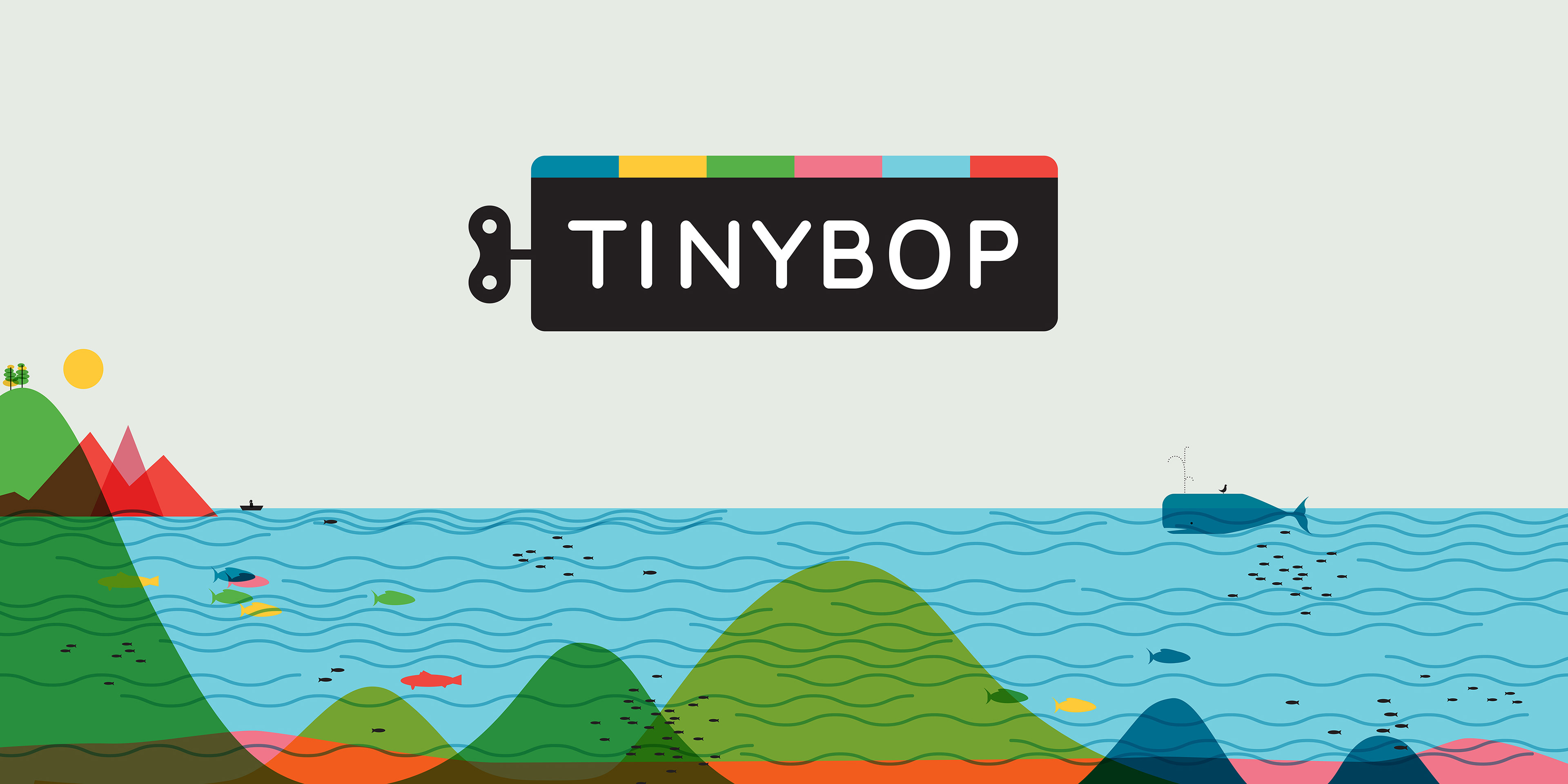
Raul had commissioned a few designers to explore logo ideas before I had met him. We both thought there was potential with one that looked like a mysterious black box with a wind-up key. I evolved this idea thinking about its context, especially for something like an app’s animated logo opener—when the key is turned, the colorful blocks drop into the box, and something new is born. What will Tinybop make next?
I came up with a system of patterns that combine an expressive color palette against a warm gray, drawing inspiration from the 1950s. (More about what inspired the development of this brand can be read here).
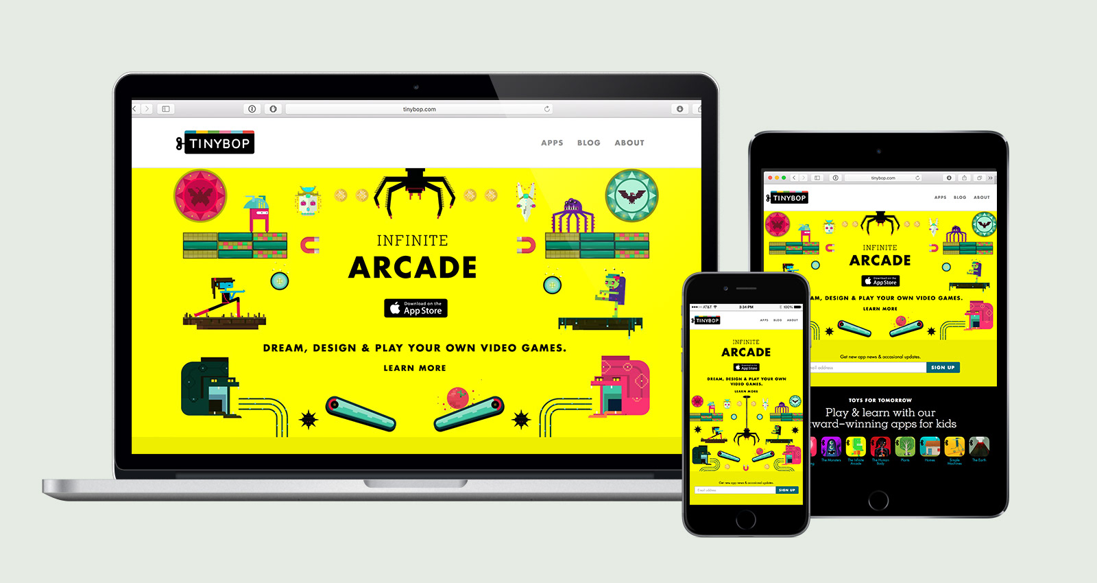
We designed a website that is tightly consistent with branded elements, optimized around product launches.
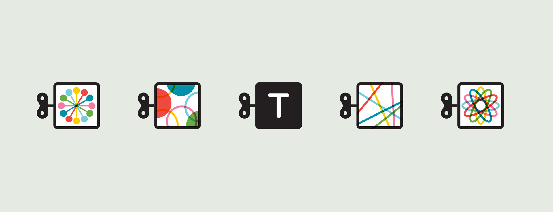
With a strong presence across social media channels, the identity minimized into a set of icons that wink at the Tinybop identity.
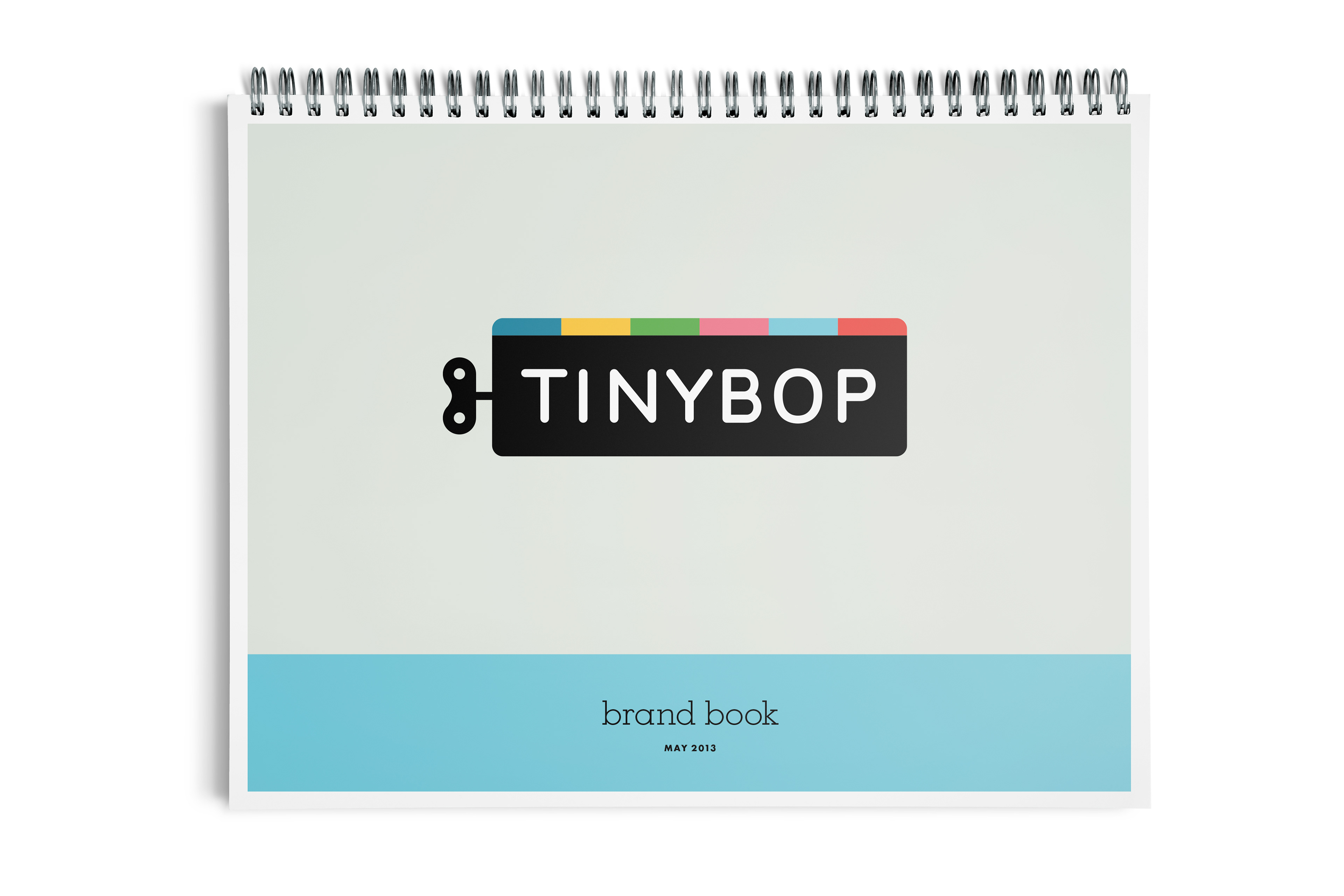
The vision of this brand was based on consistent branded elements that demand instant recognition, while brimming with creative potential to express in new and unexpected ways. A brand book shows how.
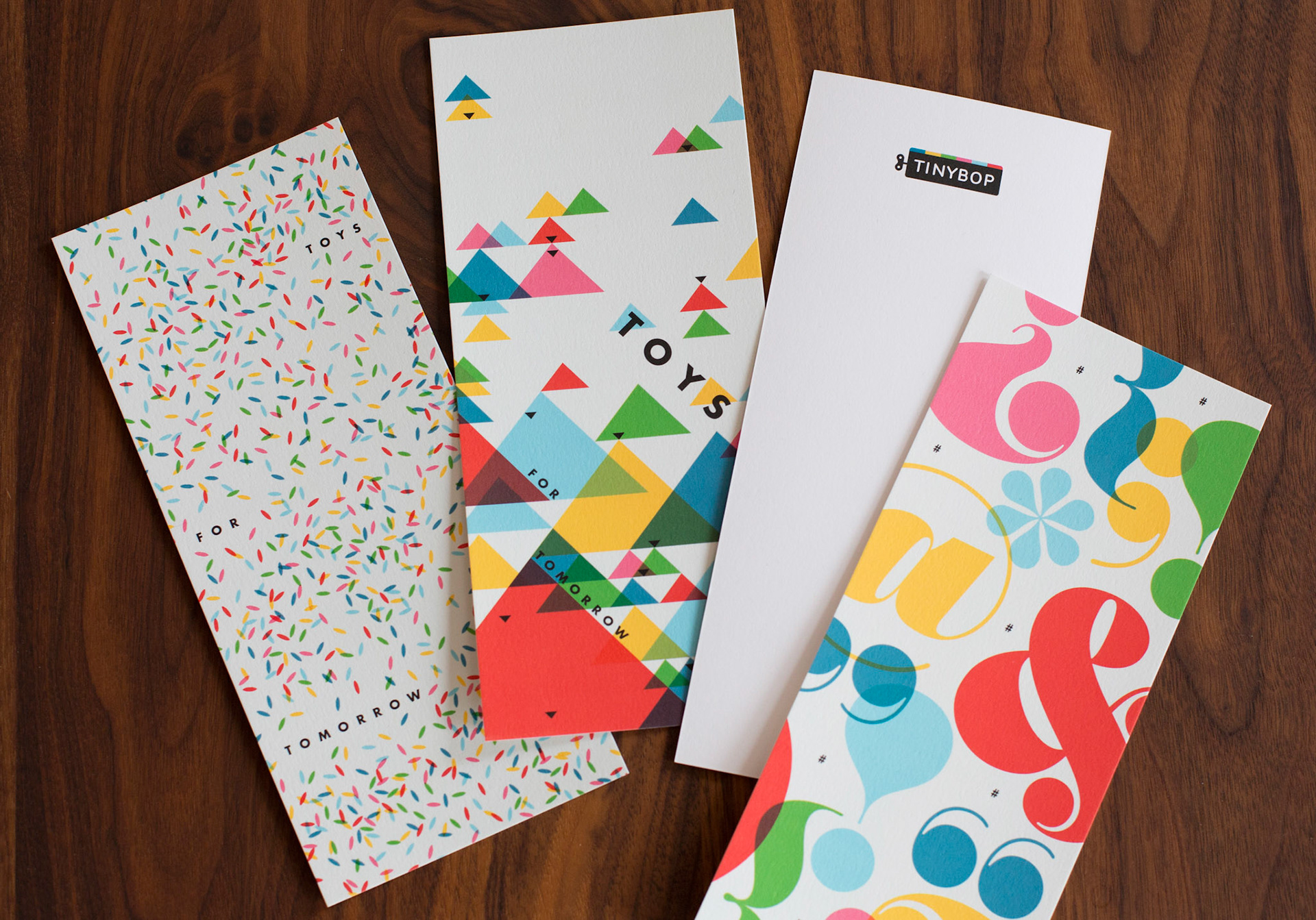
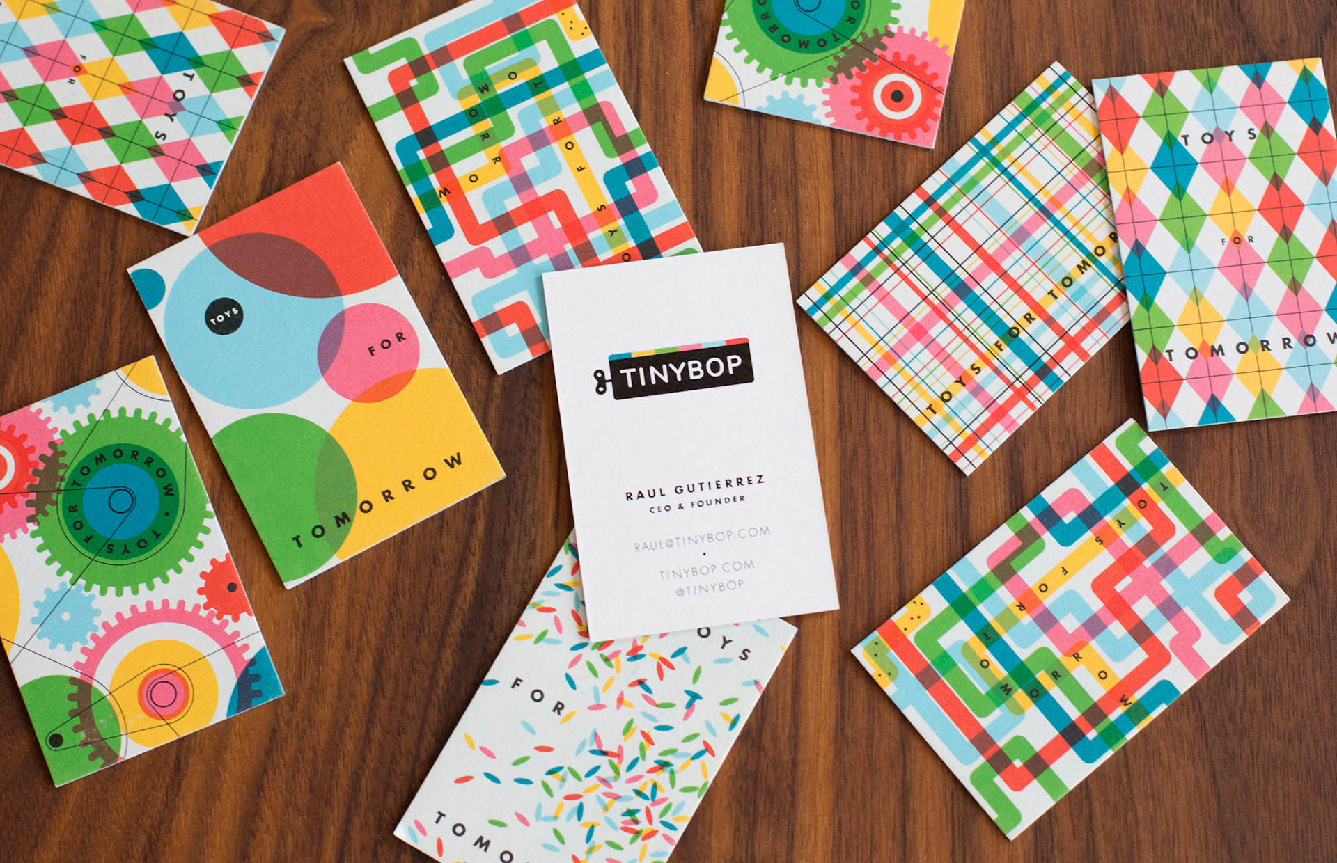
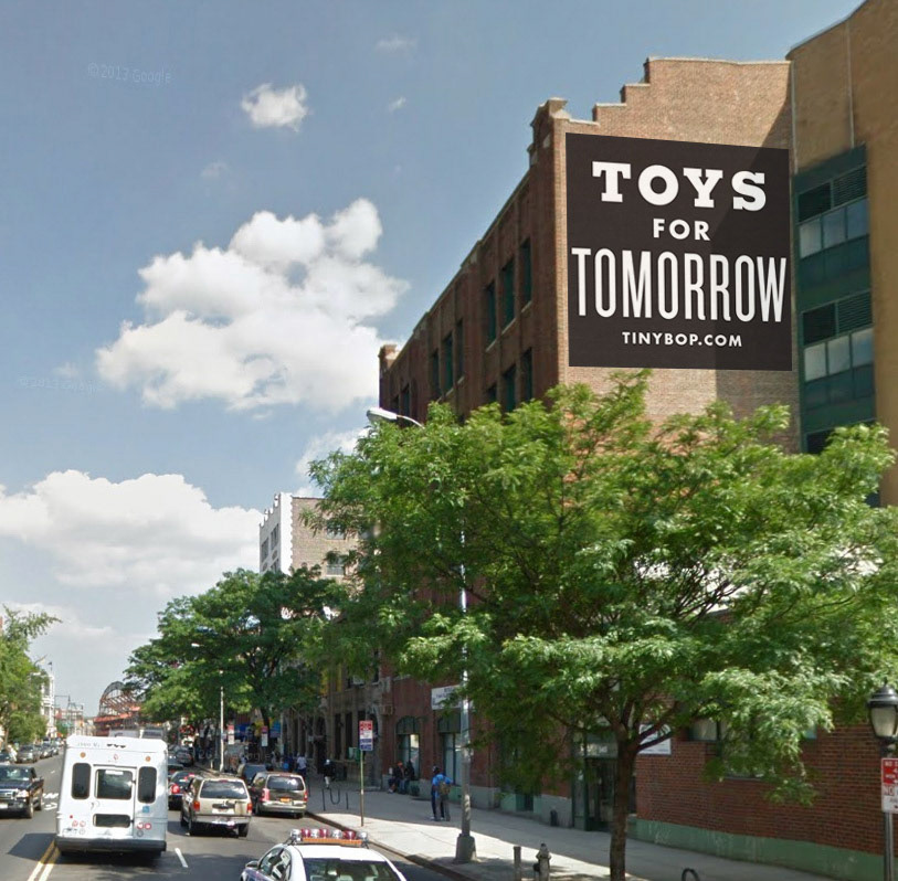
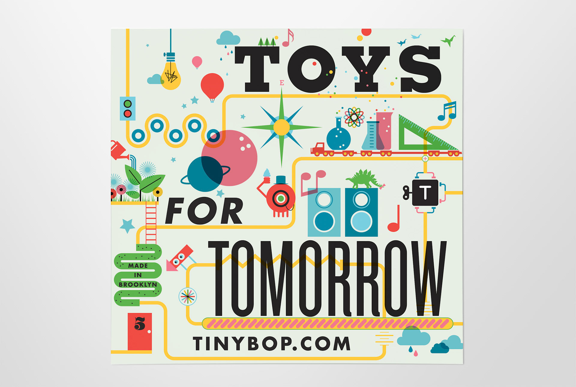
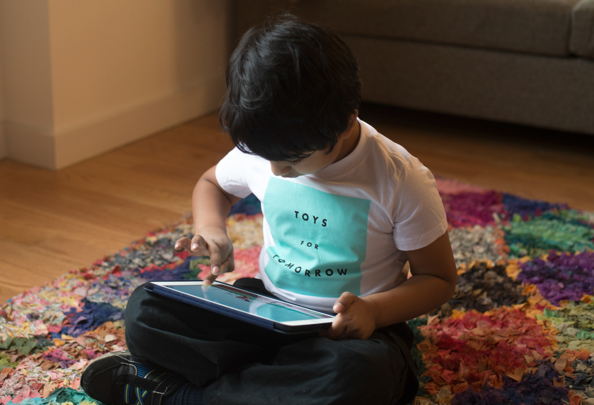
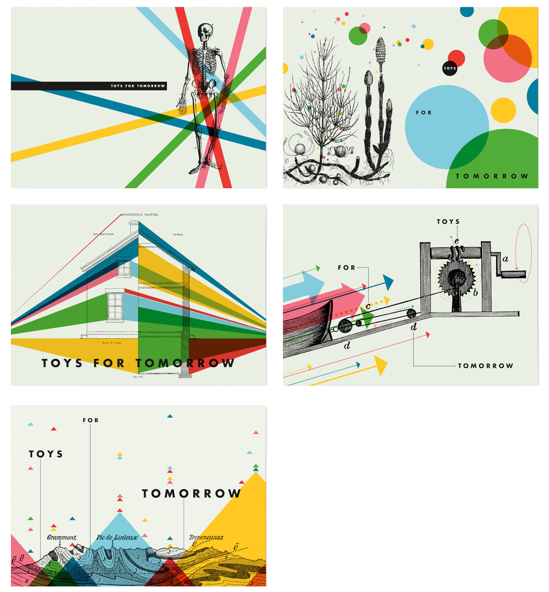
With a small team, tight control over every expression allows for a widely expressive system. A few moments for Tinybop’s tagline, Toys for Tomorrow, shows how delightful it can be.
PRODUCT
Tinybop has two series of apps that needed distinctive branding to differentiate content, while always pointing back to the main brand. Each title is always illustrated by a different artist, putting even more weight on tying the series together.
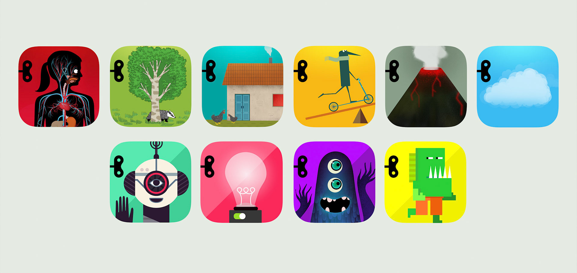
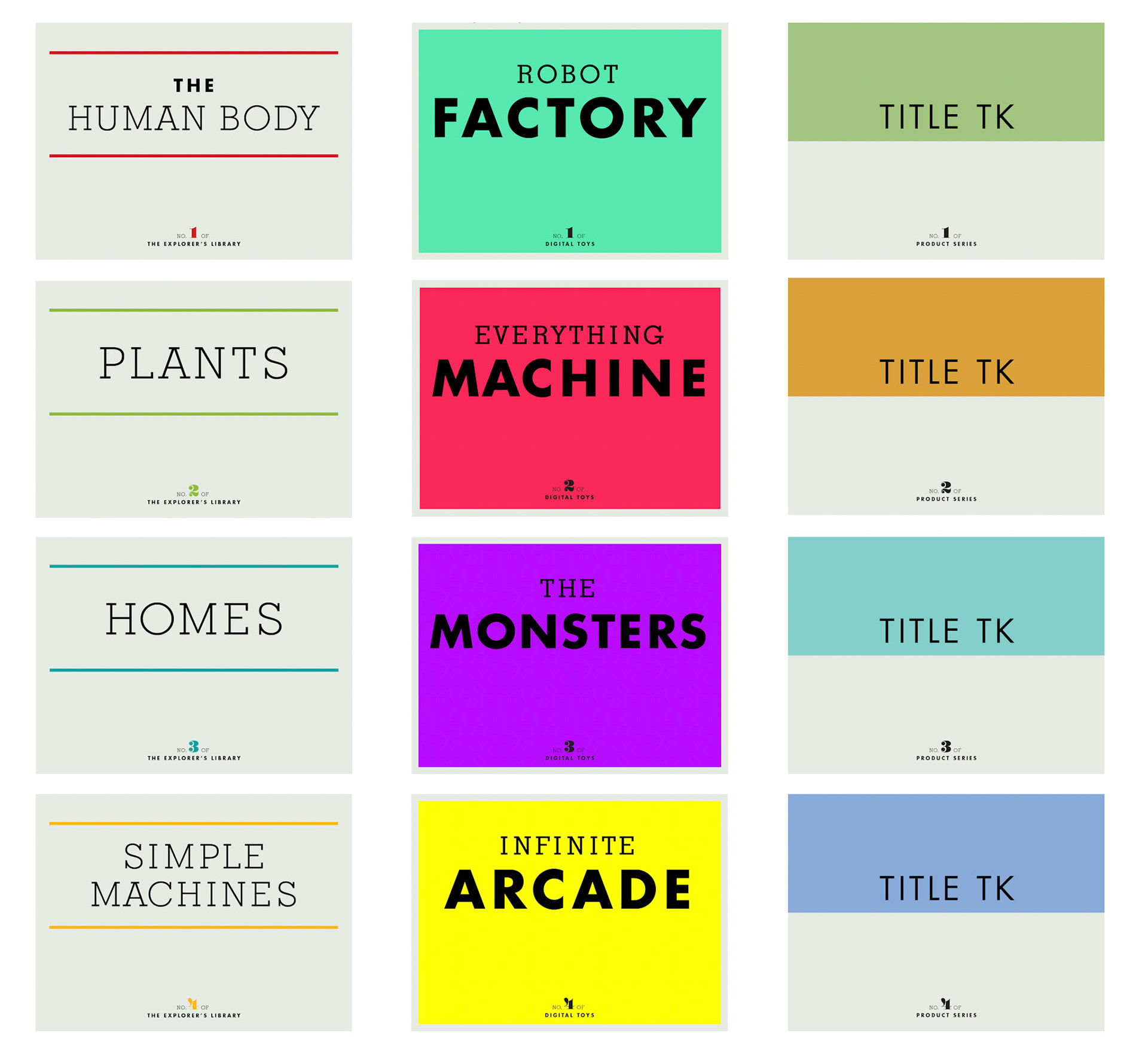
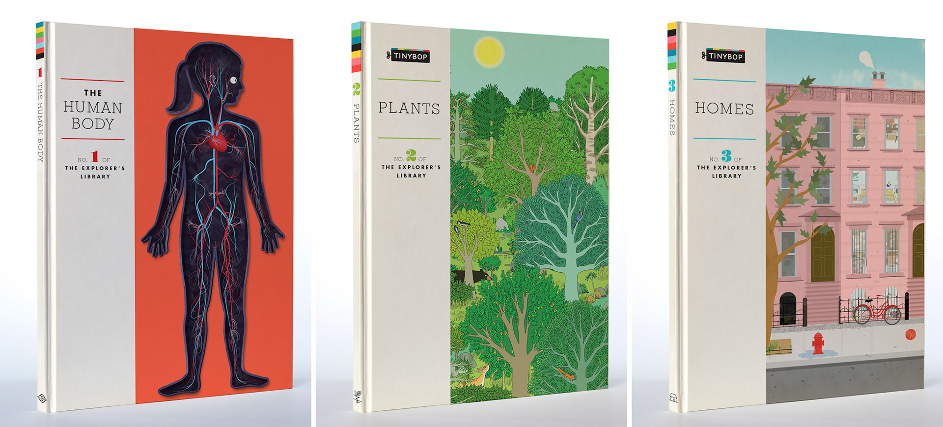
Top row: The Explorer’s Library, Bottom row: Digital Toys
For title treatments, both series use the same brand fonts with nuanced shifts in style to help differentiate the differences between the two. The signature product line, The Explorer’s Library, takes a complementary color palette to the Tinybop brand color palette, while Digital Toys uses a neon palette that accentuates its more imaginative-based play. By adding numbers to each title, the goal was to incentivize followers to collect the whole series. When plotting the product branding, we considered a third future product line to ensure the systematic approach to the system.
When searching for the right artist for each title, we often discussed the values of how weird or delightful interpretations can be while teaching kids about the world they live in. A core value in the general approach of anything Tinybop makes is to always respect their appetite for considered art and design.
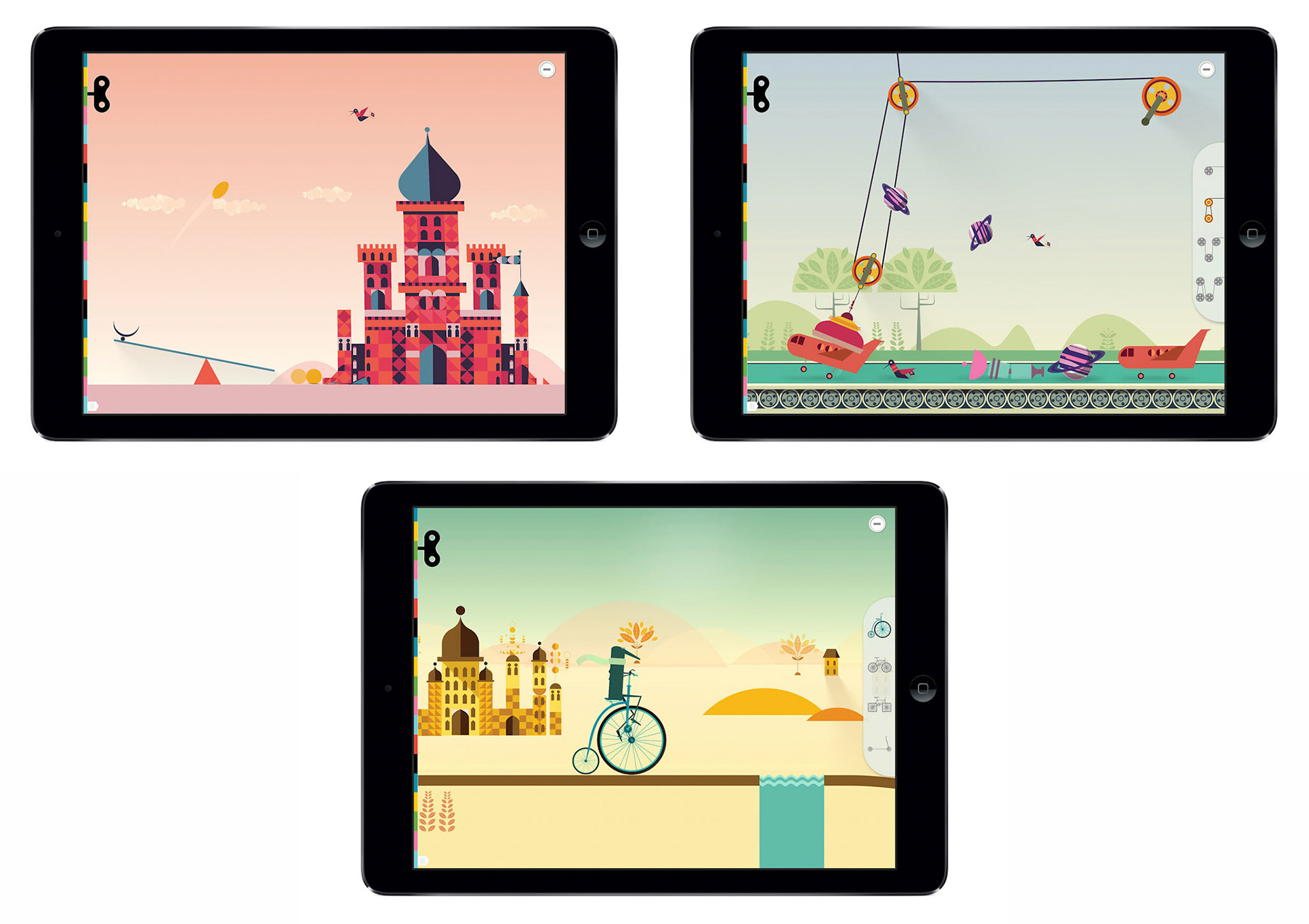
Simple Machines, illustrated by James Gilleard
With the varying levels of experience in the targeted age group, we aimed to ensure that design did not get in the way no matter how the app is used. Sandbox play was a priority, recognizing that kids love to discover things on their own (versus being told what to do). The amazing thing about designing for kids in this space is that curiosity often prevails over hesitation on figuring out how something works.
The Robot Factory is the first title in Digital Toys, the series that encourages creativity by allowing for unconventional building. A robot can have all heads and no feet, and fun failures show how applying real world physics in a testing “world” can encourage creative ideas and story-telling. This title was recognized by Apple’s App Store as the #1 Best App of 2015.
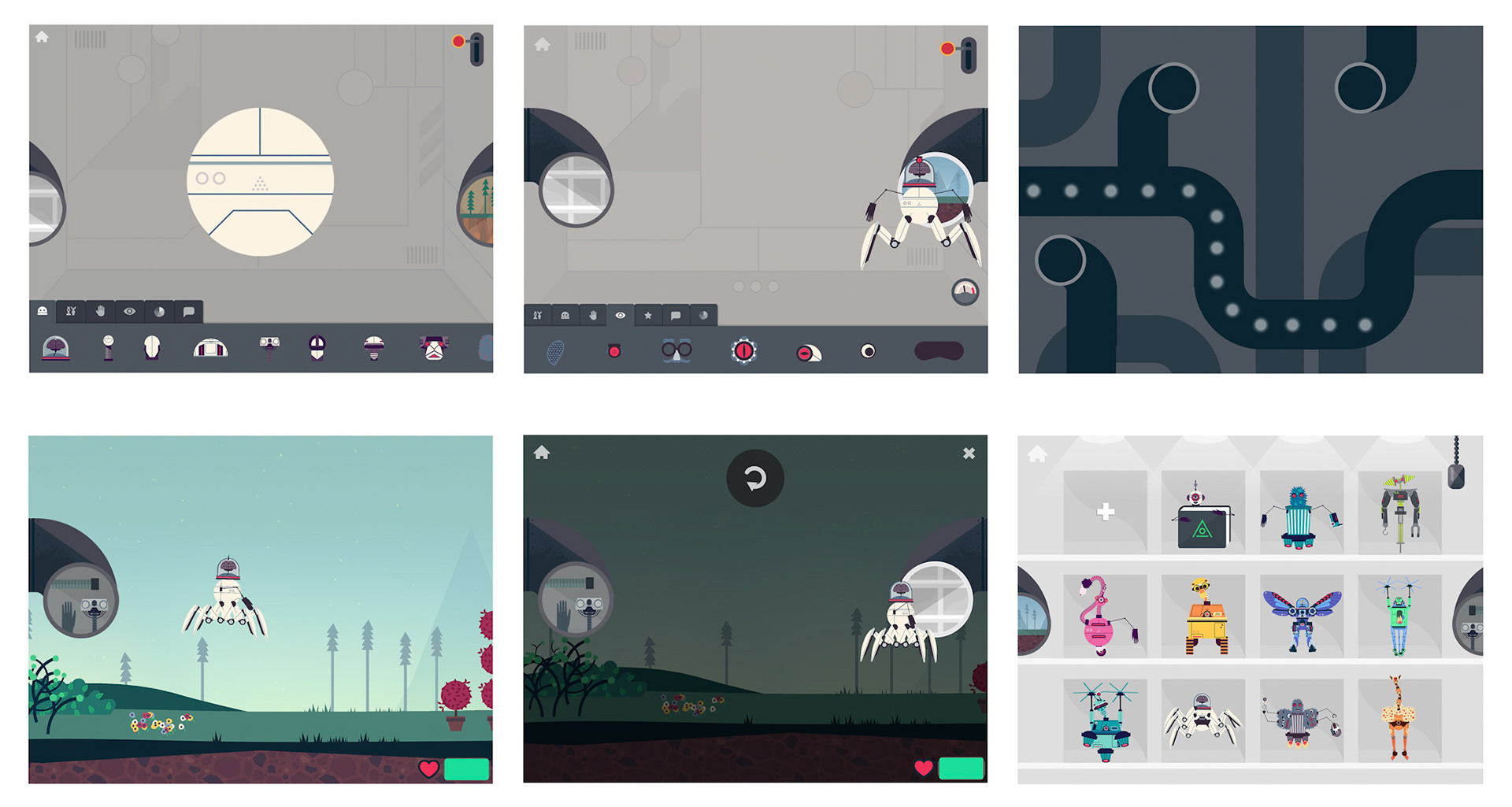
The Robot Factory, illustrated by Owen Davey
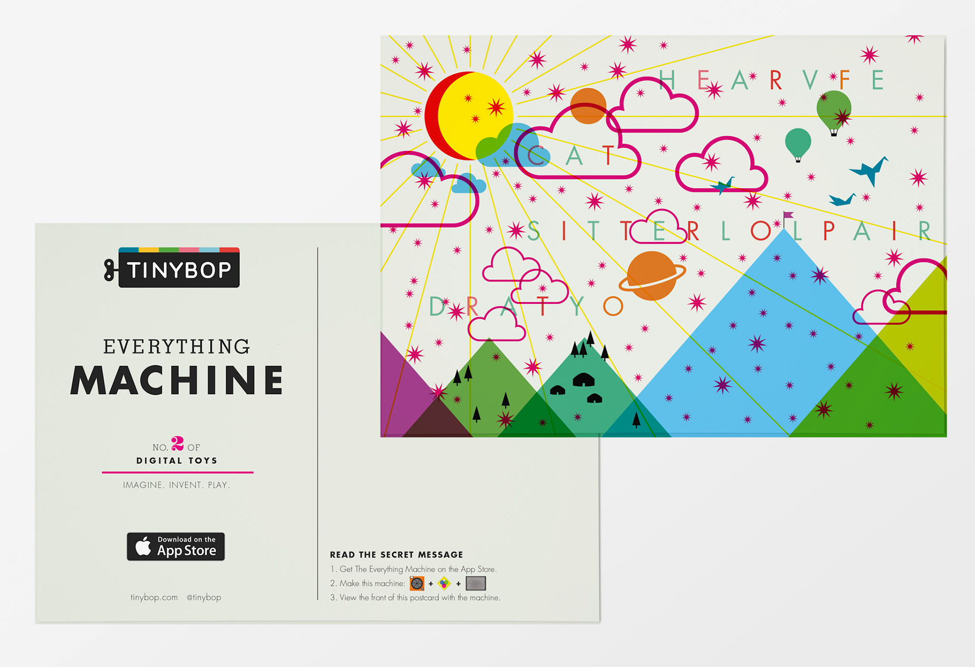
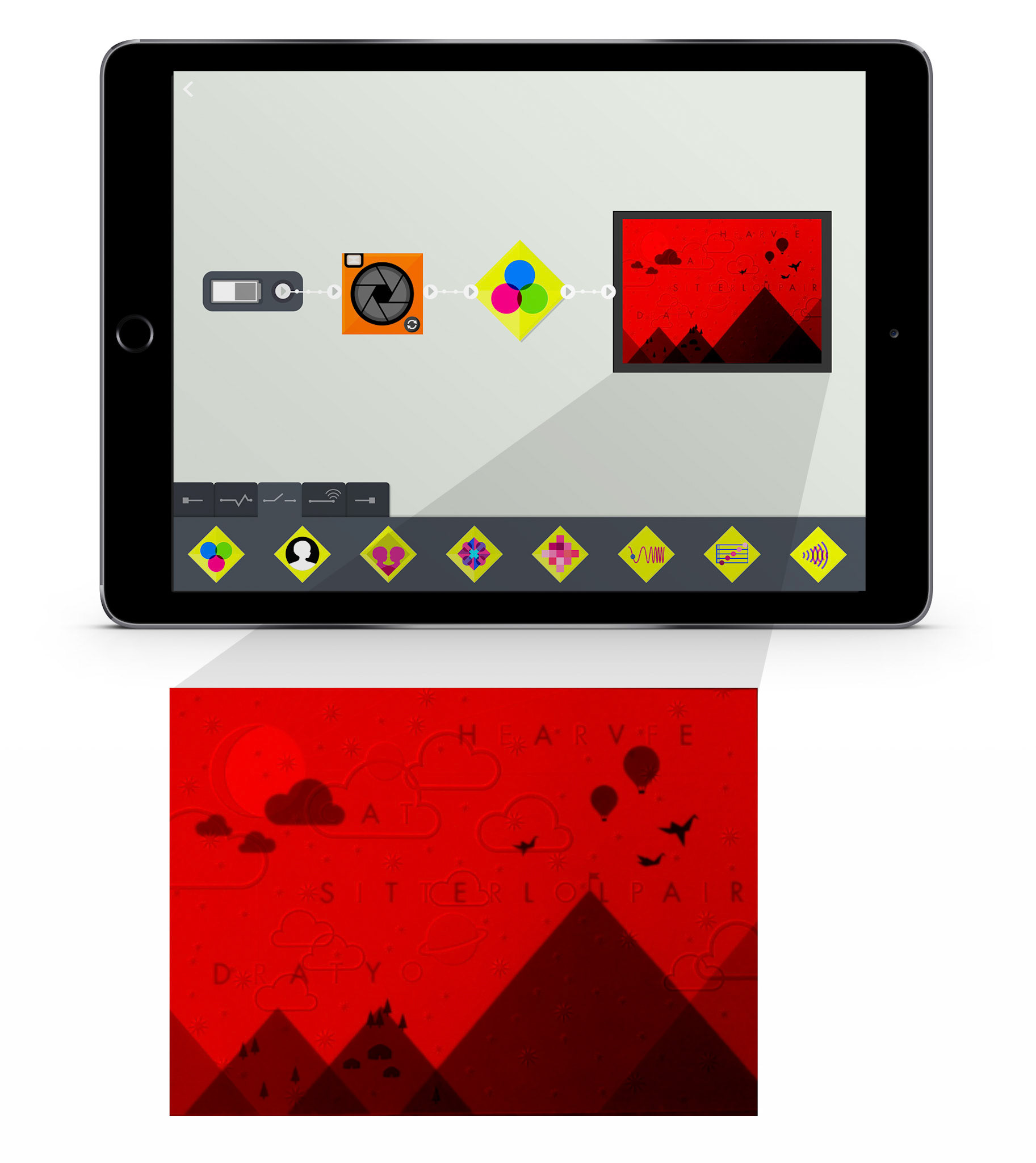
The Everything Machine was illustrated and designed in-house. Designed components in the app visually represent the hardware components of the Apple device, allowing users to make machines based on basic circuitry. Categories of parts were designed to represent function: inputs, modifiers, detectors, routers, and outputs. Here is an example of how to build a machine that can decode a hidden message on a postcard by using a red color filter on the phone’s camera.
The opportunity with a series of apps is finding moments where user experience can find consistency and becomes an expected interaction. It’s a delicate balance between finding what works, and constantly improving with a process that relies heavily on play testing and an iterative design process. The Earth, the fifth app in the Explorer's Library, enters into a globe view that shows a scrolling timeline through 4 major eons. Zooming into the Earth’s view, the user is brought to a landscape view where different areas can be explored, such as volcanoes, erosion, earthquakes, rivers and mountains.
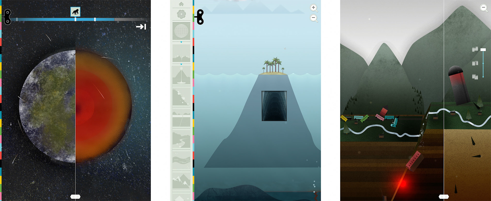
The Earth, illustrated by Sarah Jacoby
MARKETING AND PROMO
Feature banners in the App Store carried excellent conversion rates for Tinybop titles. With tight specs for responsive sizing and title safe areas, these hard-working banners were designed for maximum visual impact. Consistency from one app to the next always points back to the Tinybop brand.
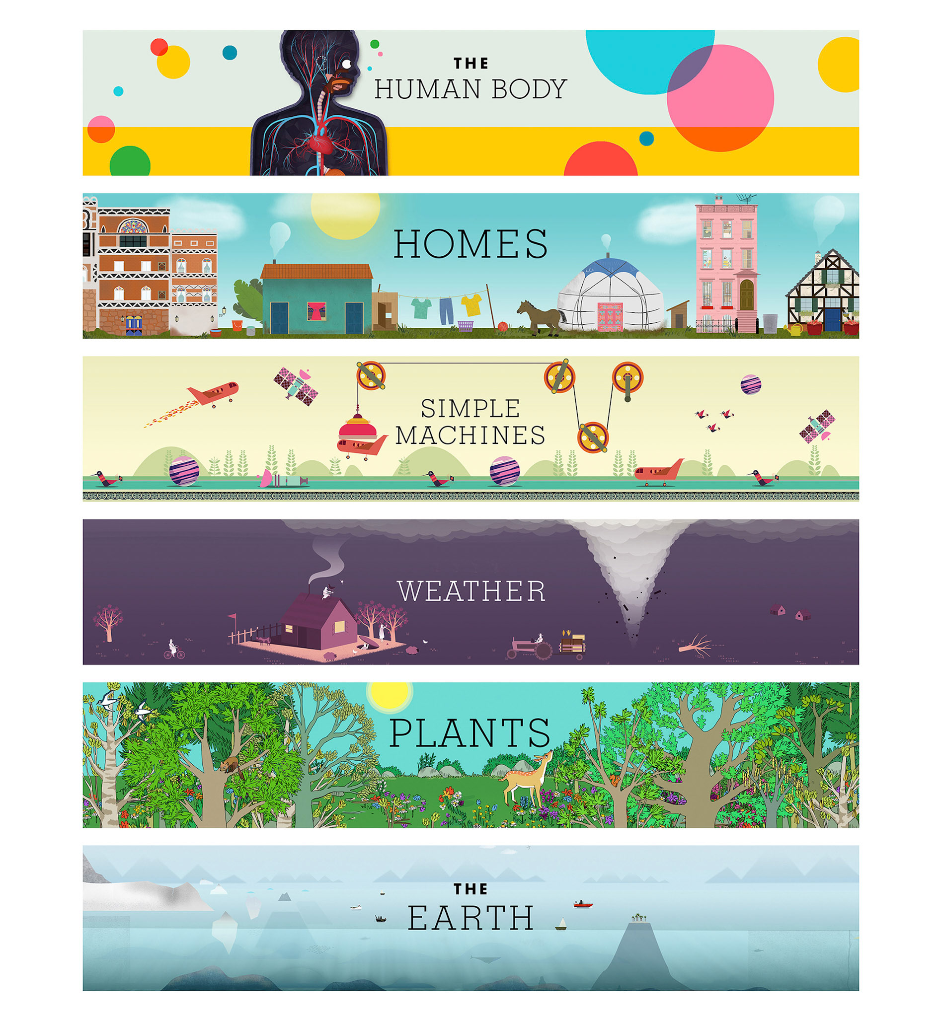
The Explorer’s Library
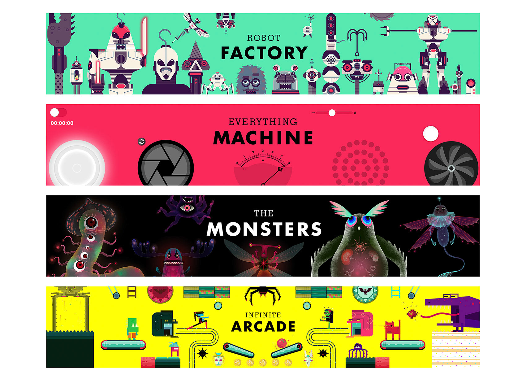
Digital Toys
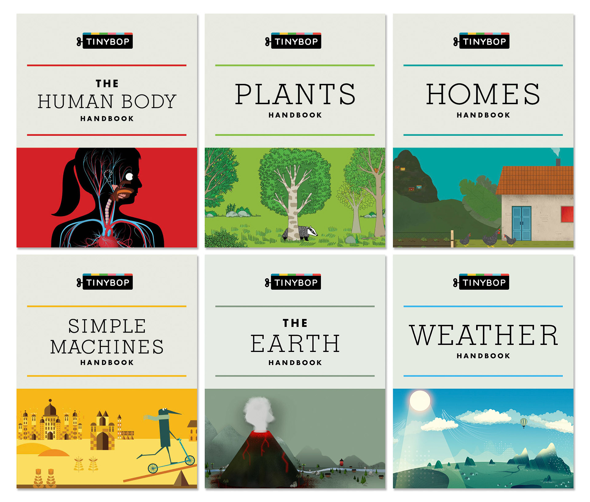
Every Explorer’s Library title has a companion handbook that is filled with research from the making of the app. By providing these guides to parents and teachers, conversations can go deeper when children have questions that demand answers. These are translated in several languages, linked within the app and posted on the Tinybop website.
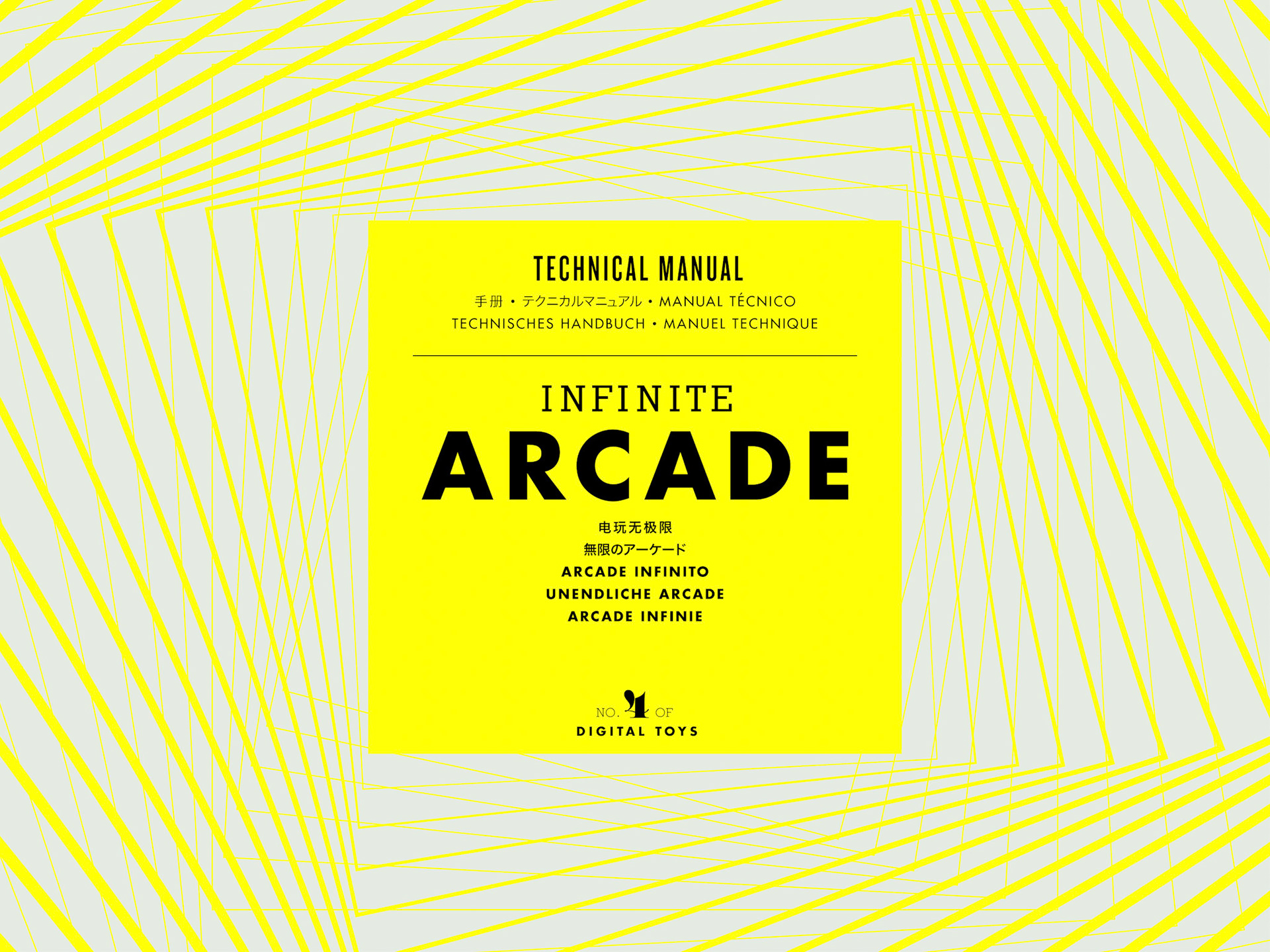
For Digital Toys, a manual is created for every title to help users with tips, hints and fun facts. The technical manual for the Infinite Arcade details all the parts in the app that can go into making a game, basic game strategy, inspiration and technical tips.
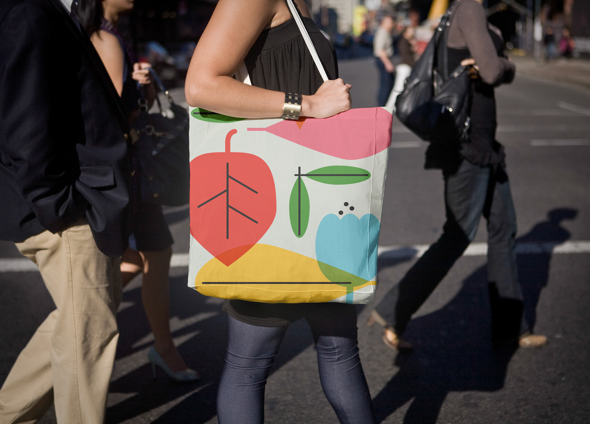
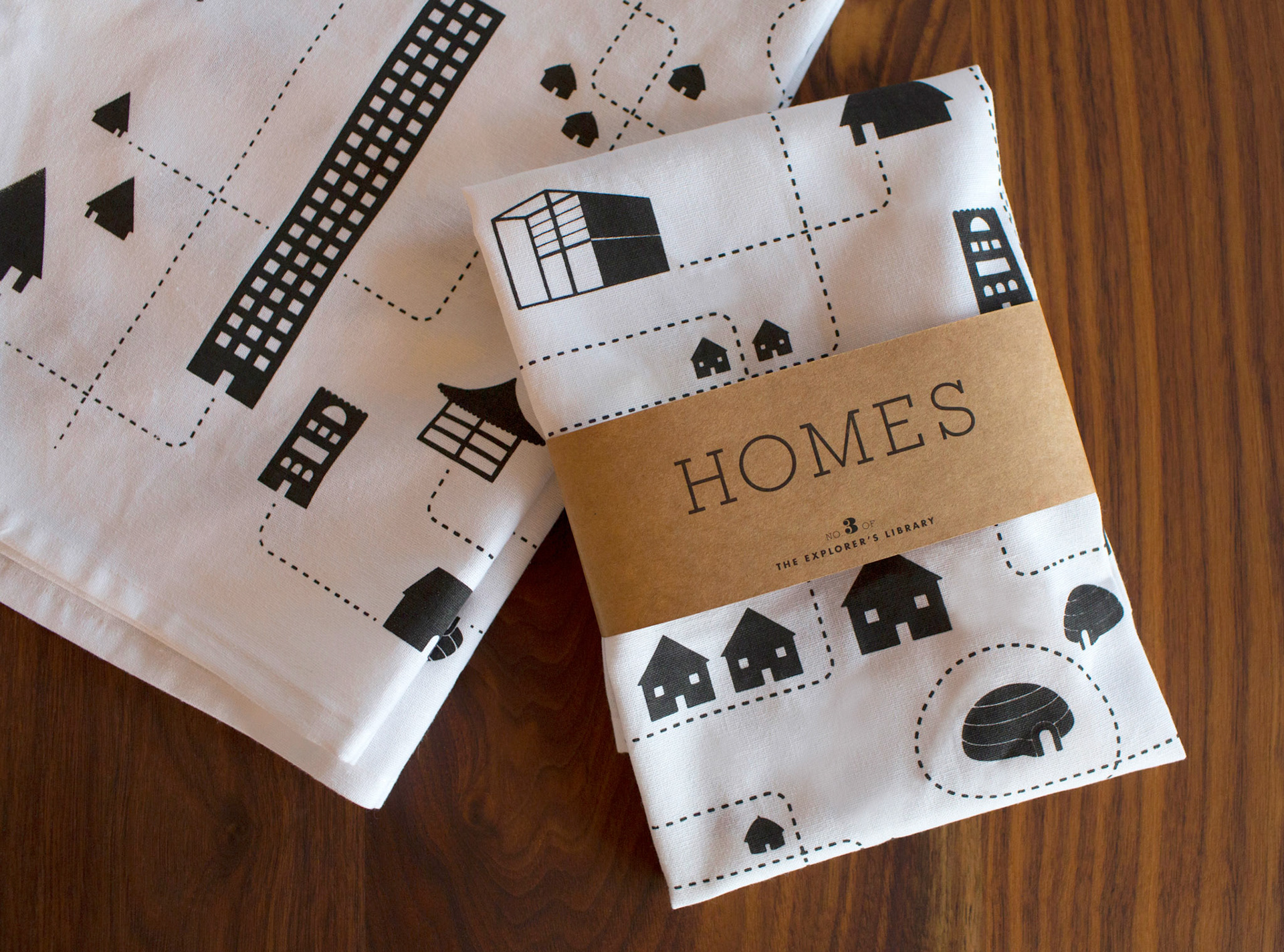
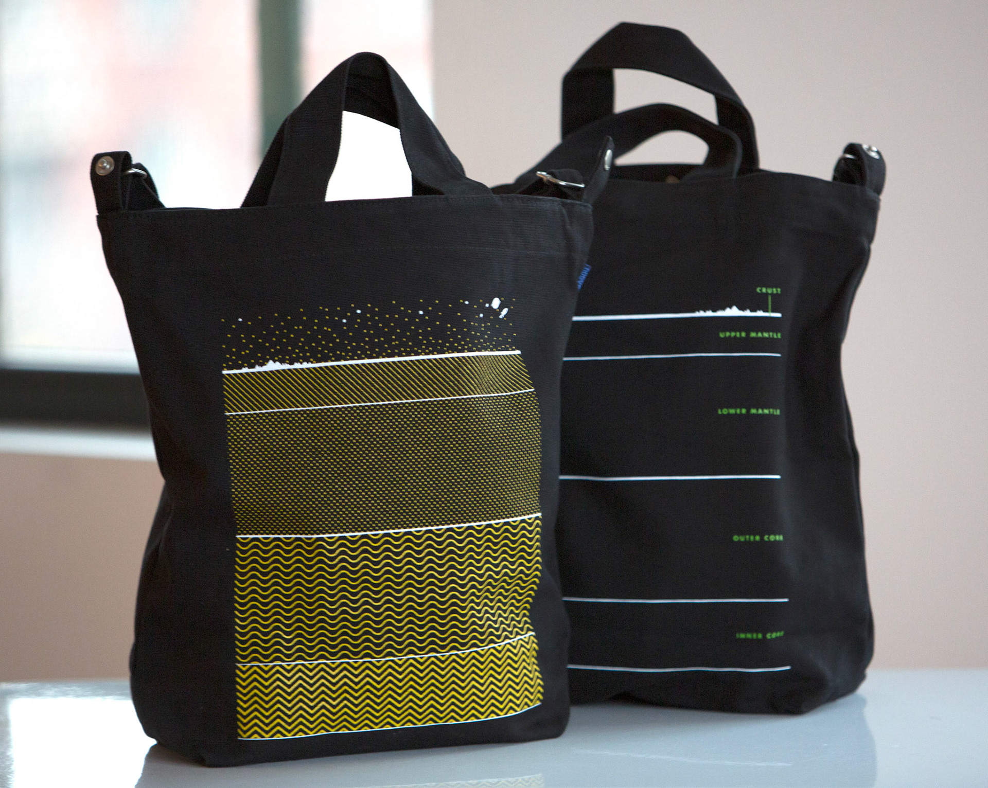
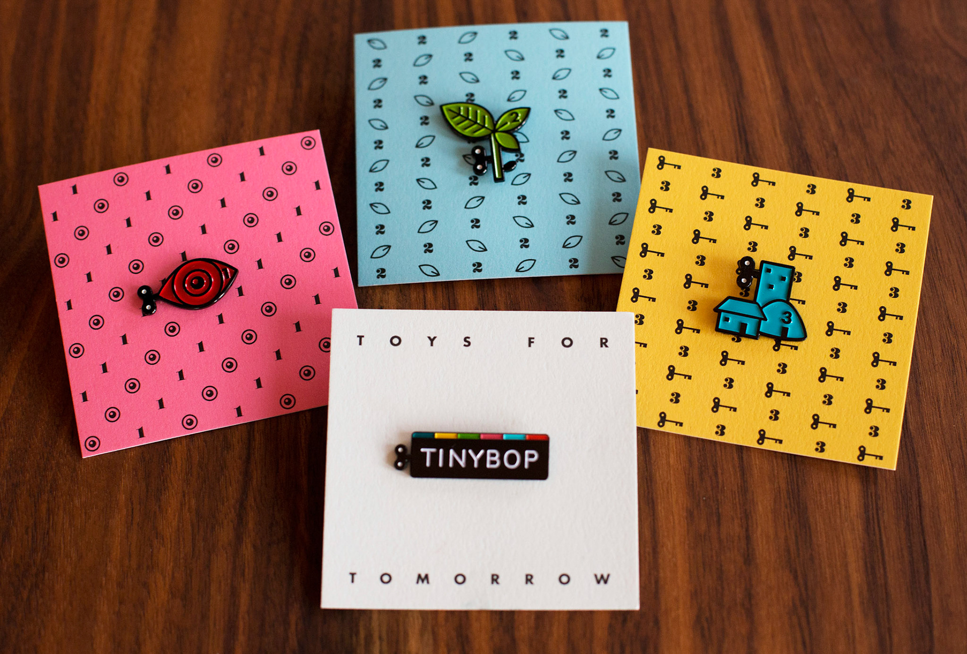
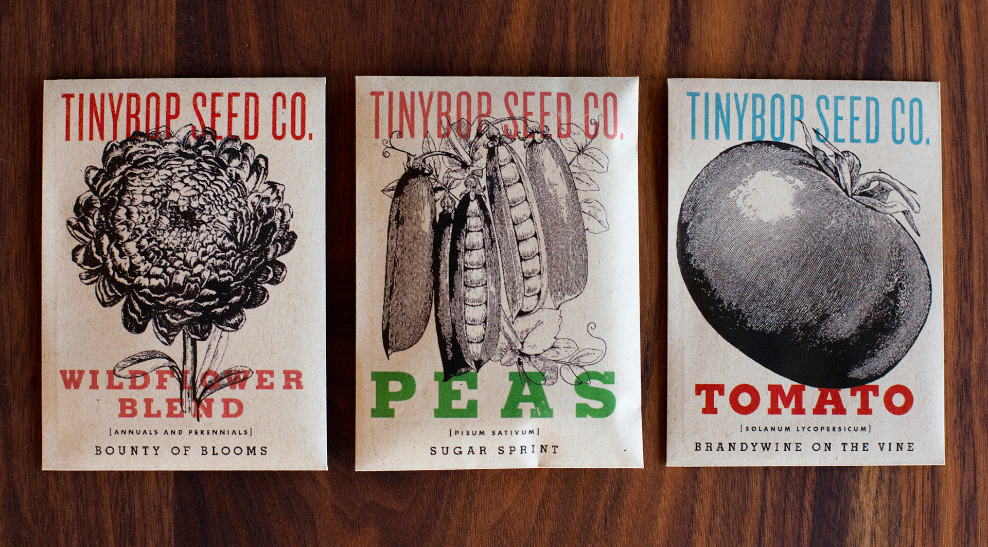
A few examples of give-aways that were made for play testers and loyal fans include postcards, collectible enamel pins, a screen-printed tea towel (in line with the release of the Homes app), seed packets with easy-to-plant seeds for little hands (Plants), and a tote bag that models the depths of the earth’s layers (The Earth).
PICTURE BOOKS
Tinybop titles were originally inspired by collectible printed books, the kind from a former era that delved deep into different topics. We reversed the digital medium back to print to conceptualize how it could be experienced in book form.
On to They Might Be Giants >