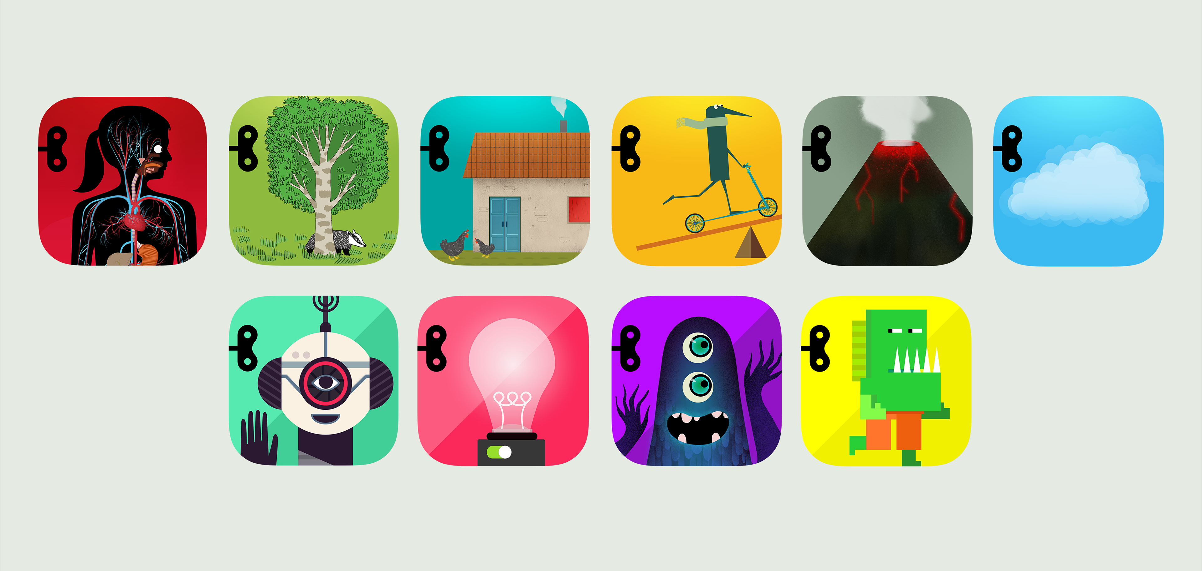
TInybop has two series of apps that needed distinctive branding to differentiate content, while always pointing back to the Tinybop brand. Each title is always illustrated by a different artist, putting even more weight on tying the series together with the aspiration that users will want to collect them all.
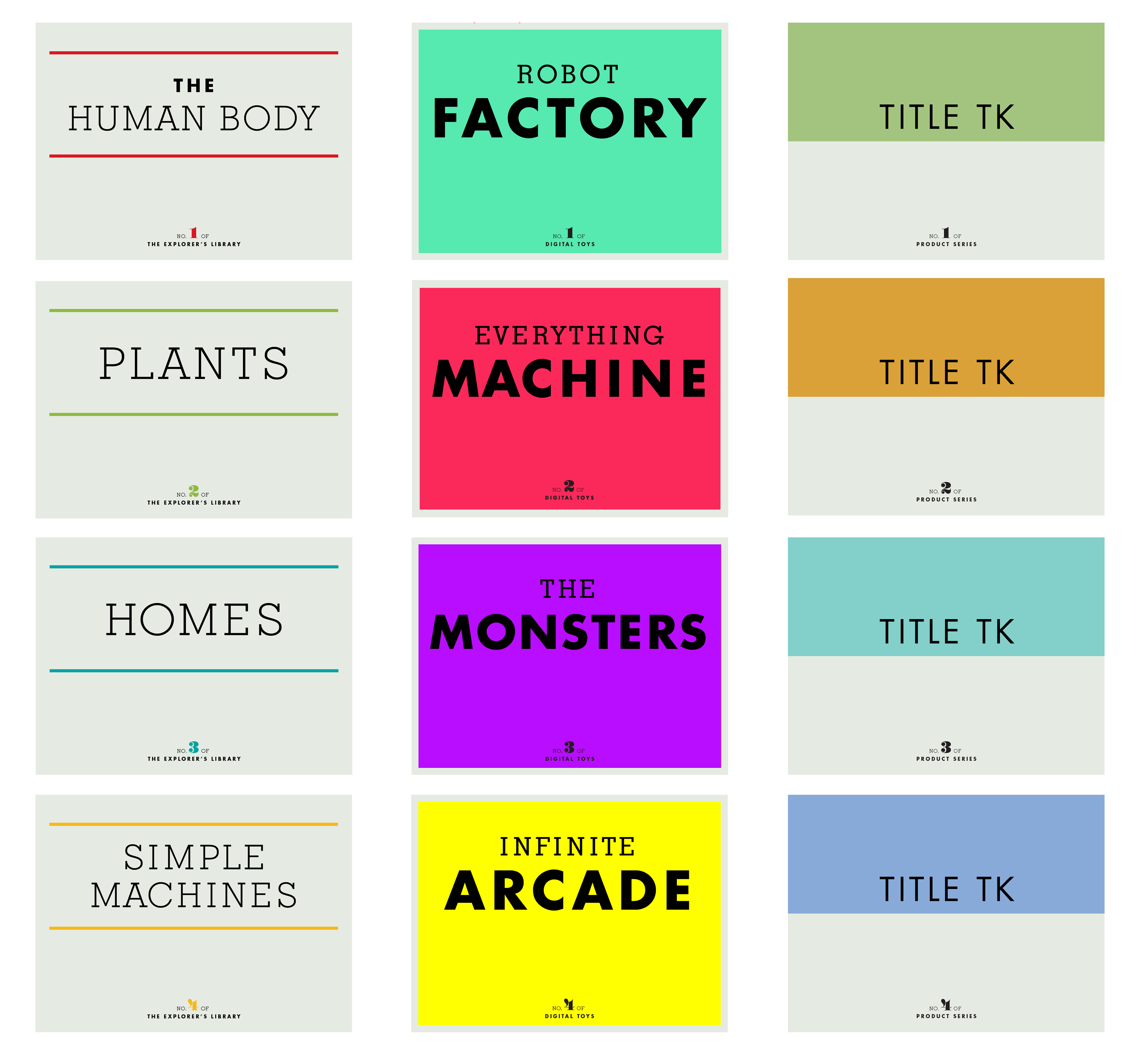
For title treatments, both series use the same fonts with nuanced styles to help differentiate the differences between the two. The signature product line, The Explorer’s Library, takes a complementary color palette to the Tinybop brand color palette, while Digital Toys uses a neon palette that accentuates its more imaginative content that fosters creativity. When plotting the product branding, I considered a third future product line to ensure the systematic approach.
When searching for the right artist for each title, we often discussed the values of how weird or unexpected interpretations can be while teaching kids about the world they live in. A core value in the general art direction of anything Tinybop makes is to never talk down to kids and to always respect their appetite for good design. Simple Machines was illustrated by James Gilleard.
With so many varying levels of experience in the targeted age group, the constant challenge was to find ways of letting the design not get in the way of the experience no matter how the app is used. A core approach is to allow for open play, recognizing that kids love to discover things (versus being told what to do), and that their own sense of wonder will prod them to ask questions. The amazing thing about designing for kids in this space is that their curiosity often prevails over any hesitation on trying new ways of doing things.
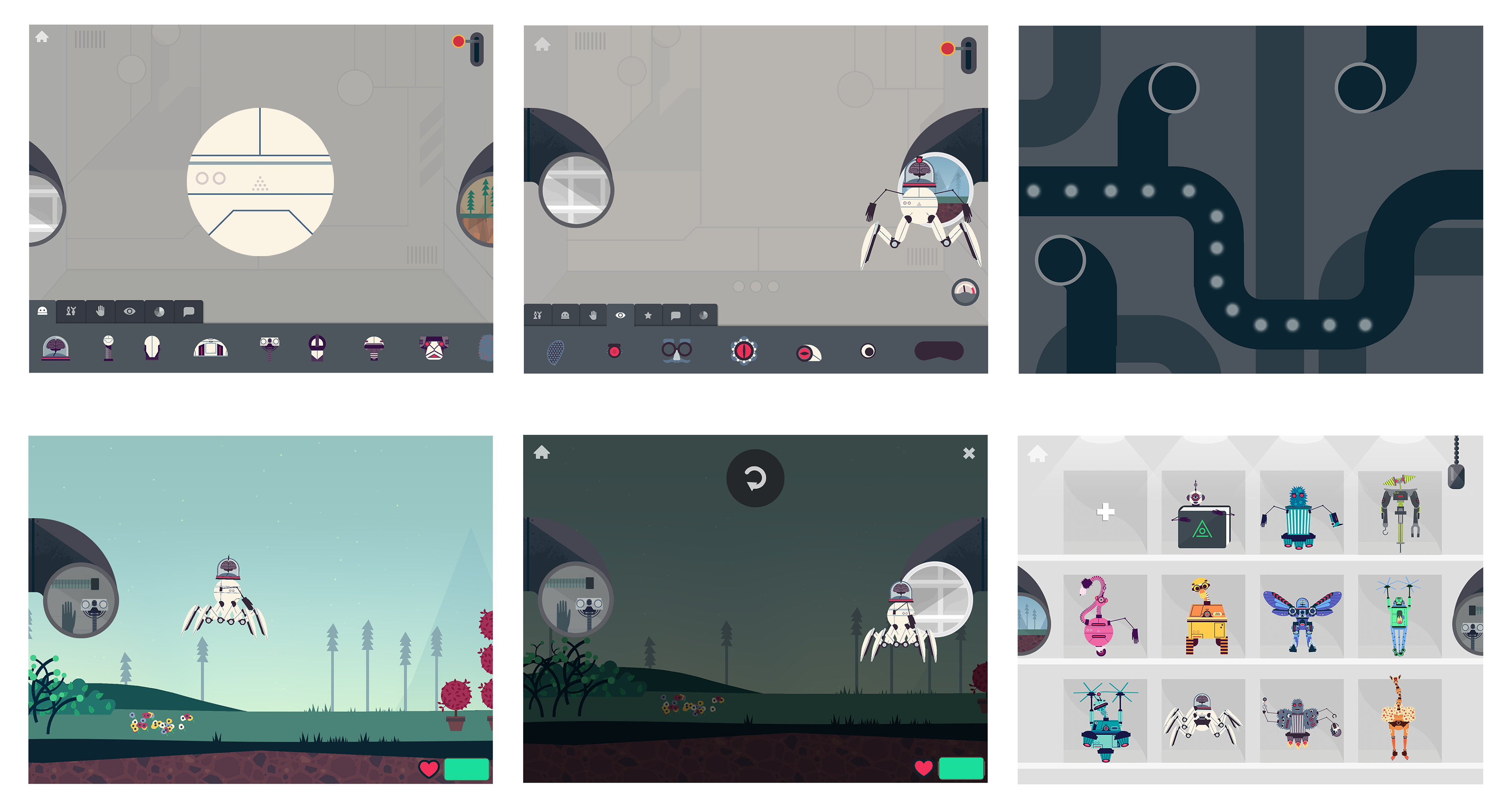
The Robot Factory is the first title in Digital Toys, a product series that encourages creativity by allowing for unconventional building. A robot can have all heads and no feet, and fun failures show how applying real world physics in a testing "world" can encourage creative ideas and story-telling. This title was recognized by Apple's App Store as the #1 Best App of 2015. Illustrations are by Owen Davey.
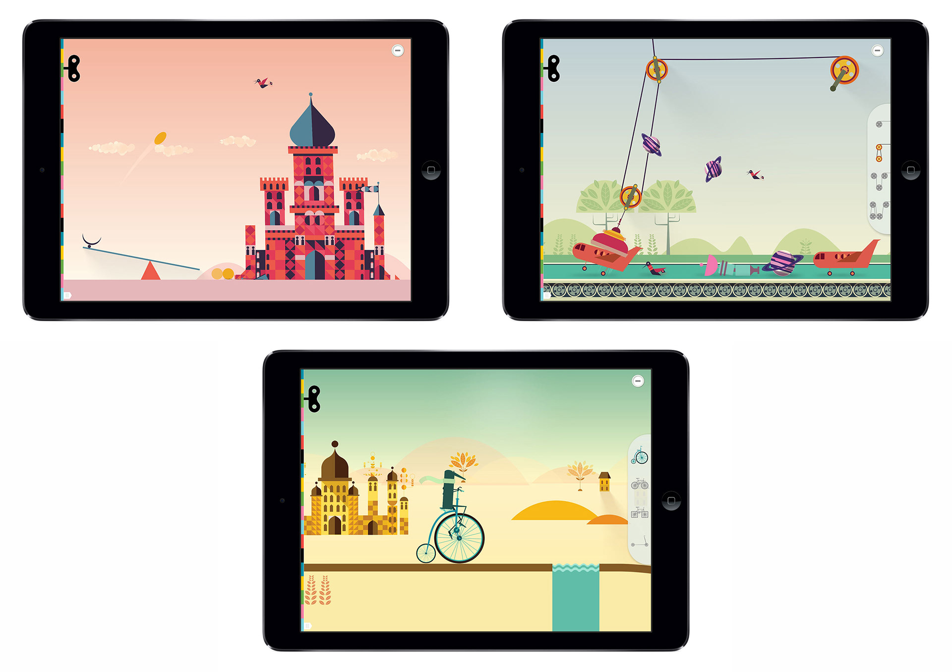
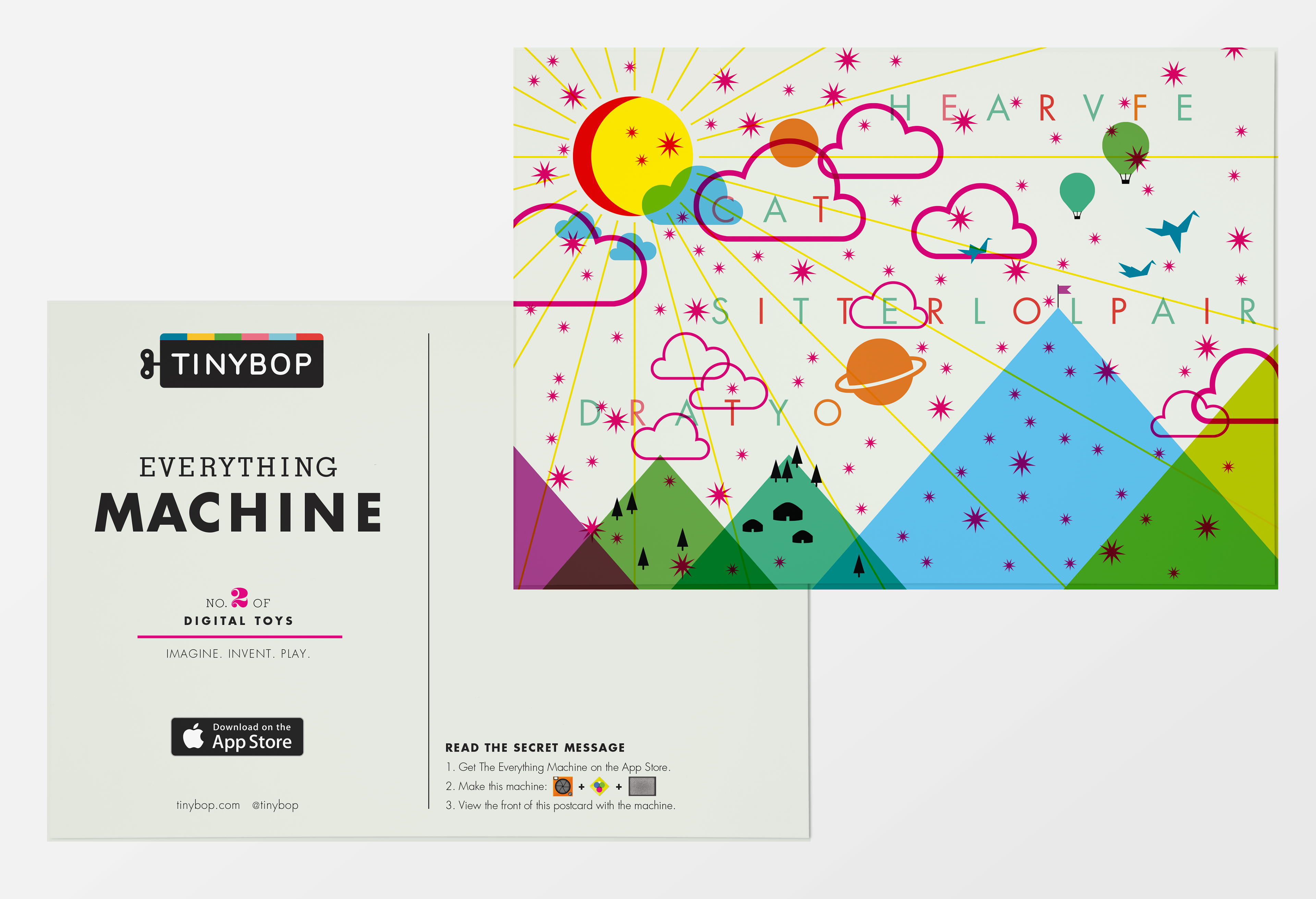
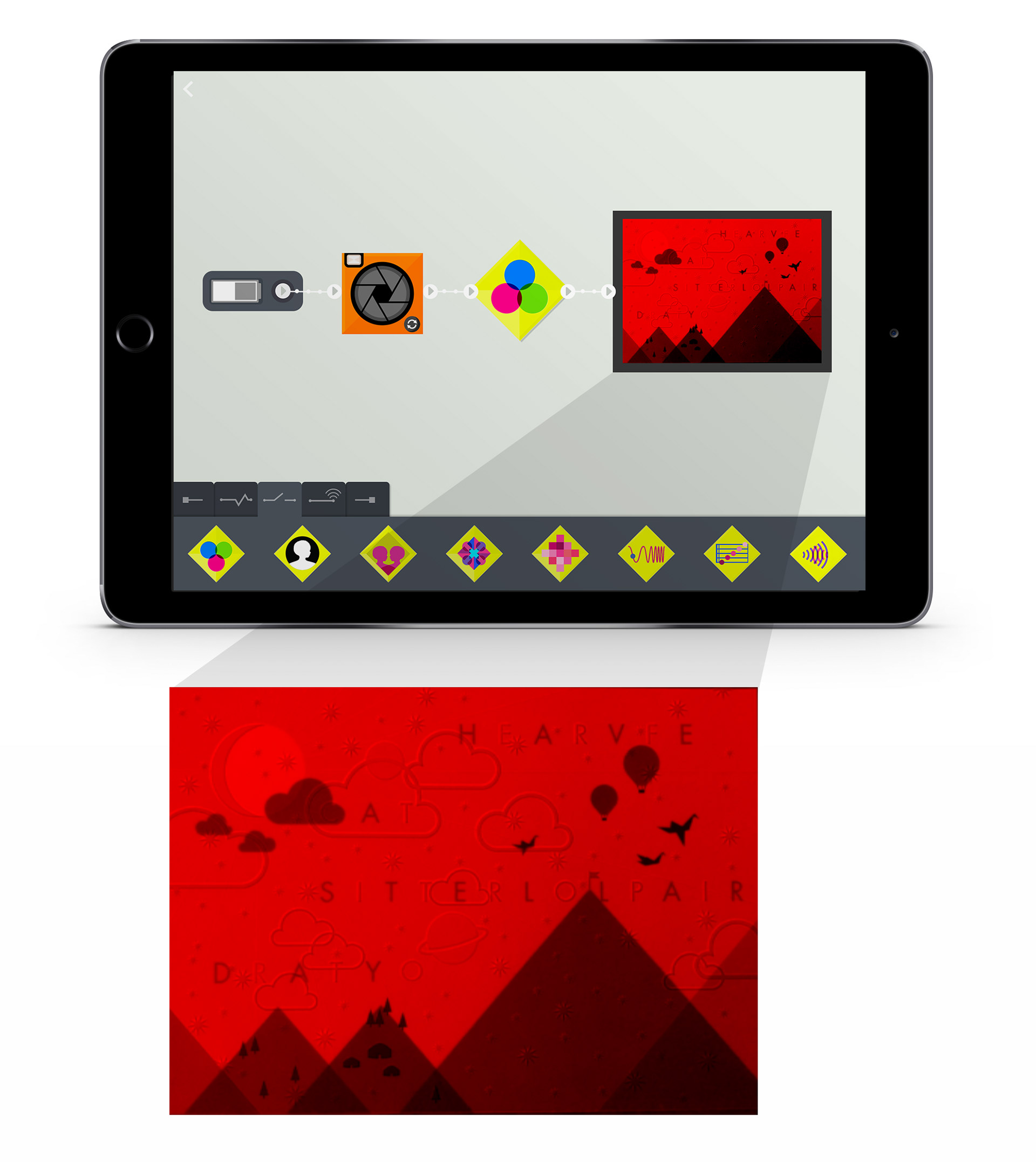
The Everything Machine was illustrated and designed in-house. Designed components in the app visually represent the hardware components of the Apple device, allowing users to make machines based on basic circuitry concepts. Basic categories of parts were designed to represent function: inputs, modifiers, detectors, routers, and outputs. Here is an example of how to build a machine that can decode a hidden message on a postcard by using a red color filter on the phone’s camera.
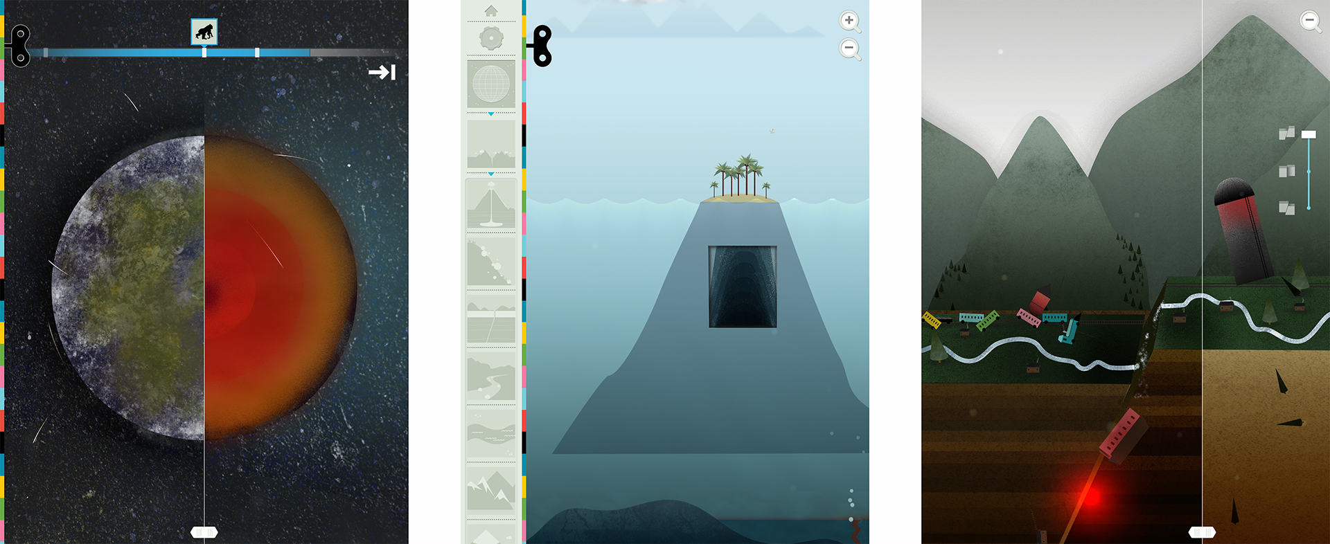
The opportunity with a series of apps is finding moments where user experience can find consistency. It’s a delicate balance between finding what works, and constantly improving on how to do things better in a process that relies heavily on play testing and an iterative design process. The Earth, the fifth app in the Explorer's Library, enters into a globe view that shows a scrolling timeline through 4 major eons. Zooming into the Earth's view, the user is brought to a landscape view where different areas can be explored, including volcanoes, erosion, earthquakes, rivers and mountains.