As the organization behind Sesame Street, Sesame Workshop had purposefully minimized the presence of its visual identity in support of the instant brand recognition that came from the beloved children’s show. But the importance of sharing its mission to help children everywhere—by expanding original programming beyond the Sesame Street brand and supporting global outreach initiatives—escalated the need for a stronger identity.
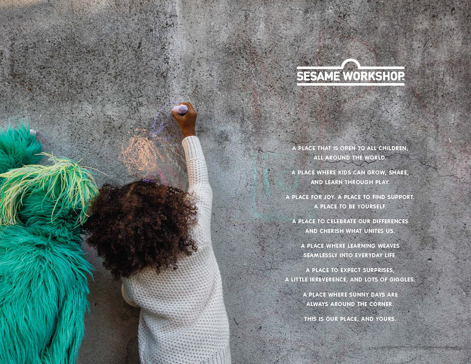
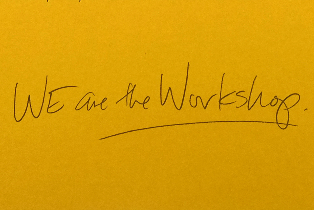
Working with a newly commissioned logo, this project started with a request to build a visual identity system. The more I dug, the more I saw that with very limited opportunities for a visual system to play out, there was a greater need to ensure clarity when the Workshop brand so often appeared in support of individually branded content or messaging (eg. Sesame Street or Ahlan Simsim, a co-production that appears across the Middle East). Studies into language, graphics and motion investigated this relationship. A focus on voice and messaging emerged to tell this rich and layered story, starting with the idea that the Workshop denotes a place. What does it do? Why is it necessary? What does it sound like? Who is it for? This resource became a culmination of examining what the Workshop stands for and how it comes through everything spoken, experienced or visualized.
I wish I could share more about this internal project.
Writing partner: Jake Nassif
Client + creative partner: Theresa Fitzgerald
Client + creative partner: Theresa Fitzgerald